it's all green
LOGO DESIGN, BRAND STRATEGY & COMMUNICATION
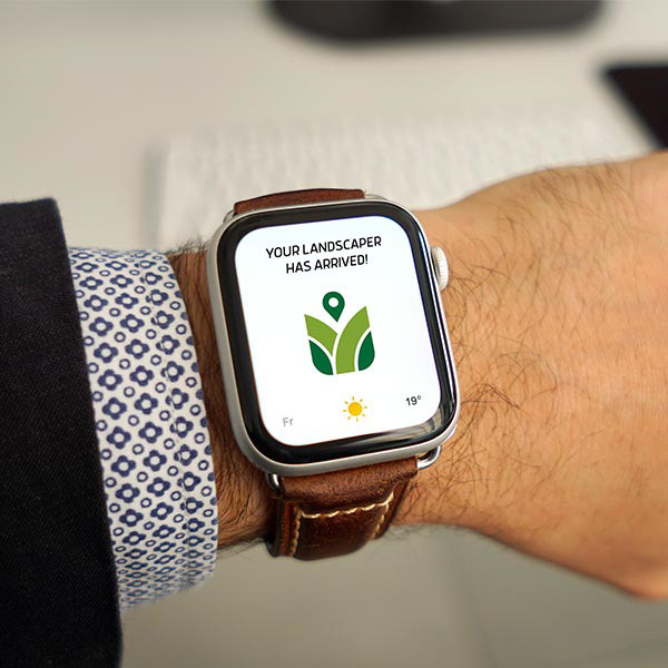
The owner of It’s All Green Lawn Care reached out to Hann Creative in need of a minimalistic logo that could grow with the company. With a short term goal of becoming the top provider of lawn treatment in the area, we still needed to create a brand that could go head to head with the best lawn care providers in the country.
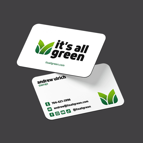
It’s All Green is targeting neighborhoods with homes priced $300,000 and up with a focus on yard treatments rather than clean up and maintenance. It’s important that the logo and colors be simple and clean so they aren’t an eye sore when the branded trucks and equipment are in the neighborhood.

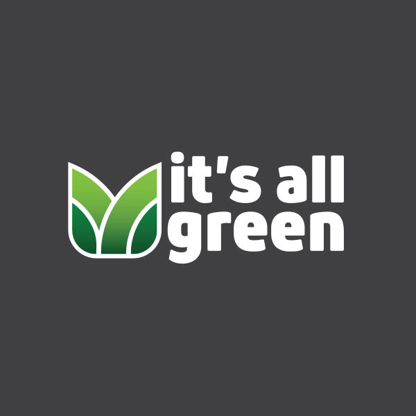
A typical grass icon can appear scattered and unorganized, so we avoided that completely. The weight, balance and texture of the logo shows stability and organization. This makes the logo easier to read and is a better representation of the way It’s All Green does business.

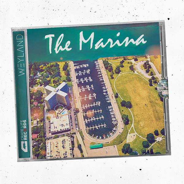
crate life records
LOGO DESIGN, ALBUM ART, BRAND STRATEGY
Weyland was looking for a creative logo for his nostalgic music company Crate Life Records. This design needed to be cool enough to stand out in the music industry of this generation, but also pay homage to the generations that came before. The logo is frequently used on album artwork and flyers so it needed to be strong enough to stand on its own against all sorts of different backgrounds.
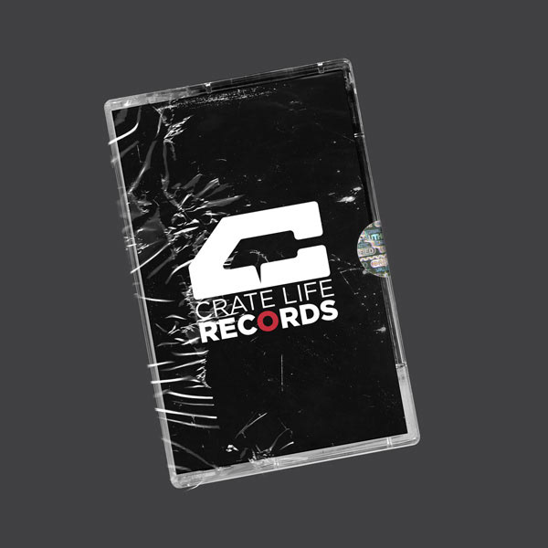
Since Weyland's focus is vinyl samples, we chose the record player needle as the icon for this brand. Rather than separating the icon, we placed it into the negative space of the “C”. All of his project starts there, the bottom of the needle points directly to the red “O” in records, symbolizing the start of a recording.

fern house salon
LOGO AND SIGNAGE DESIGN FOR HIGH END SALON IN CHARLOTTE, NORTH CAROLINA
The interior designer of the Fern House, Mike Watson, reached out to Hann Creative in need of a unique logo for an high end salon in Charlotte North Carolina. Fern House is a peaceful escape from the day to day, a place where self care and relaxation are considered a necessity.
Fern House has a calm, modern atmosphere. Upon entry you notice lots of plants and organic materials, calming smells and colors combined with bright personalities and creative energy that helps build excitement for the experience.
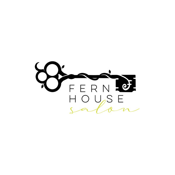
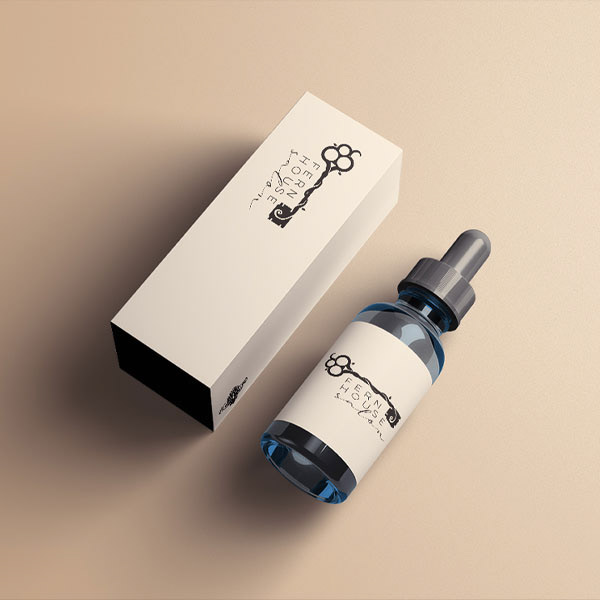
Our task was to create a logo that spoke to women between the ages of 30-55 with annual household income between $95,000 - $450,000. The design was to be used on marketing material, signage, product packaging, bags, boxes, aprons and more. Another important aspect of this project was the location. Fern House is located in an old house in a popular neighborhood in Charlotte called Plaza Midwood. We needed to create something that was traditional so it matched the building and history of the neighborhood, but also modern enough to fit in with the updated personality of the area.
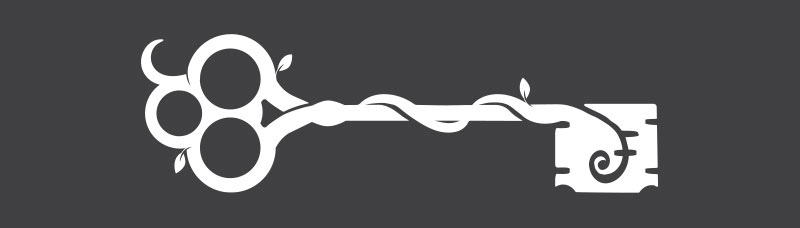
We decided that the key was the perfect icon for Fern House. A key to your secret garden, a symbol that reminds the client how to get back to her happy place. Easily recognizable and relatable, but also customized to fit the neighborhood and the target market.
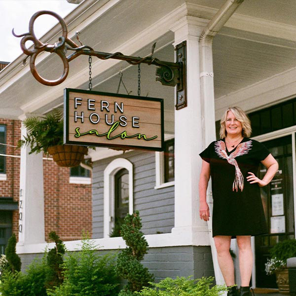
I was inspired by a vine growing in a garden near my house that wrapped around itself in a beautiful way. By adding the flowing vines to the shape of the key, I was able to bridge the gap between the man made elements, the key and the scissors, and the organic theme of the salon. This combination is also represented in the typography. “Fern House” is very stable yet elegant, in a modern sans-serif, while the words “salon” are in a sweeping script.
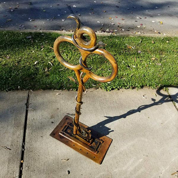
I also created a signage concept where the outdoor sign would hang from a large key, shaped exactly like the Fern House logo. We were able to send my design to a fabricator, where they created an exact replica of the logo from which a custom wooden sign hangs. This turned out beautifully and still hangs on Central Avenue for thousands of drivers to see each week.